W. Eugene Smith
W. Eugene Smith is a fabulous photographer who refused to conform to society's view of 'proper photography' with his brutal and vivid images of the chaos of WWII. He was also a well known journalist, his ability to take photos only increased his creative value. Smith entered WWII and took photos of the war as it progressed and was wounded while trying to capture the gritty photos. He worked for many different magazines during his lifetime including Life magazine.

I like this photo because there is a truth behind it. I wonder who that man is talking to on the phone and what significance it had to the situation in the room, the women who look agitated and nervous. The ability to capture an emotion or a set of emotions in a photo is a wonderful thing and this is what Smith has done. He has made the situation more real, caught in the moment through a camera.

This photograph makes me sad when I look at it. It's not just because of the probably dead child in the soldiers arms, it's because of the soldier holding it. These were once innocent men, not touched with the horrors of a brutal war, and someday long after this photo was taken these men probably still wake in terror from post traumatic stress. This war changed a generation. Once again Smith was able to capture this gritty reality in a gritty photograph.

This photo was featured on the cover of Life magazine. I like it because of the darkness on the man's face, not jut the shadowing but the dirt and sweat, and then the shocking white color of the cigarette he holds in his mouth. When men were away at war smoking was one of the only normal routines they had, the one thing they could control. It's ironic to think it probably held some sort of hope to them, "If I survive today I'll get my cigarette," they might have said. The determination Smith has caught in this soldiers eyes says, "I've survived another day and I've earned at least this."
William Eggleston
William Eggleston is mostly known for his usage of color in his photographs, sometimes even especially bright. He believed that his artwork was so bold that it should hang in honor in many galleries all over the world. He was inspired by Robert Frank, a well known Swiss photographer. He was a big fan of dye-transfer printing because he loved the way it enhanced an image. He was awarded the Outstanding Contribution to Photography Award in 2013.

I like this photo because of the colors. It may be shallow to say but after researching so many black and white photographers it's nice to have some colorful image. But as we were taught in Photo 1 color does distract from the actual image and I think it does so here. It's a fantastic image but looking at it without all the colors and tones is it really that great? To me the colors make this image, not the subjects.
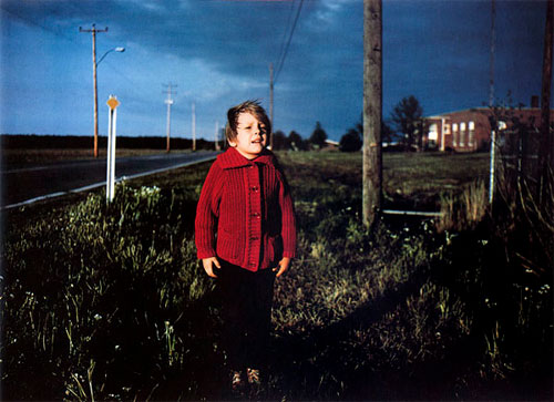
The effect one color has on a photo is amazing. The dark blue grey color of the sky mixes so nicely with the forest green grass it almost looks as if the sky and ground are blended together. Then you have the child in the shocking crimson coat which is what your eyes are drawn to immediately. The use of colors and color patterns in this photo is amazing and the vividness is also appealing to the eye.

The normality of this photo is striking, but once again color seems to mask the imperfections of the subject itself. The girl's face is very pointed and the lighting could have been better. But I think that's what makes this photo, that it looks like he saw a pretty girl and took her picture in the spur of the moment. That's why it's a good picture, because it looks like if someone asked why he took it the answer would be, "Why not?"
No comments:
Post a Comment